
Welcome to article #6 of The Combat Report, the development blog for the alternate-history love and war VN, Steel Hearts.
Continuing the break from character-themed blog posts, this one takes a look at the “writing style” of the VN as a whole, plus a quick dive into some of the UI design.
Steel Hearts Has No Prose (and That’s a Good Thing)
A clickbaity heading, but I couldn’t resist.
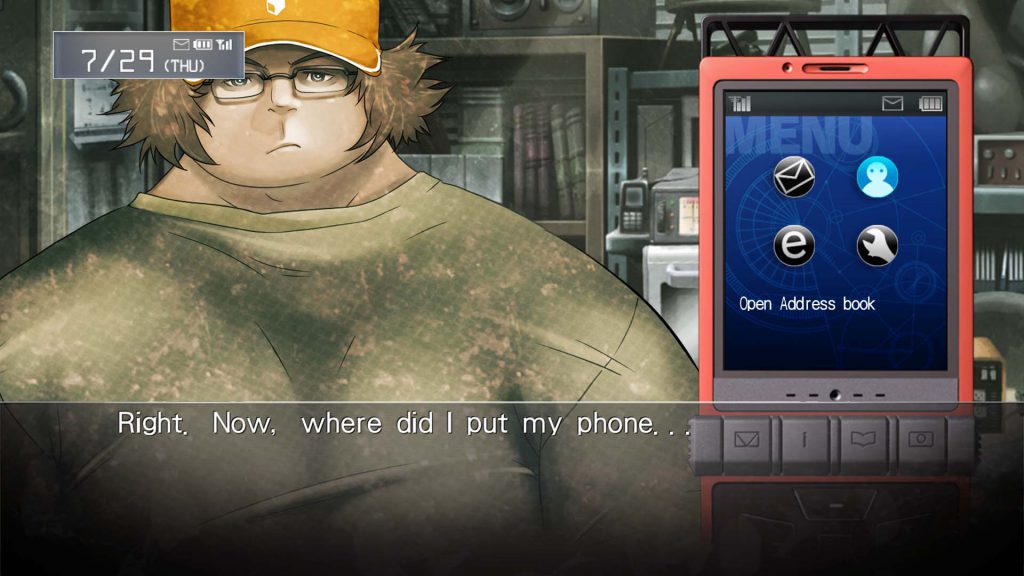
An interesting aspect about the visual novel medium is that it’s very unstandardized–there is no solid guide on how a visual novel should be created. Some have branching paths and routes, others don’t. The ones that lean more toward the dating sim genre have schedule systems and maps. Some are in NVL style where text fills the screen, while some are ADV style, where text is displayed, usually in a box, along the bottom. Some VNs are wholly textual, while some have minigames. Some create whole new mechanics to fit the narrative, like the cell phone in Steins;Gate. You get the idea.
The variety and nonstandardization is what I believe sets apart VNs as a medium. With a novel, plot aside, you know what to expect. A series of linear chapters to the end, with most of the mechanical variance being the tense and point of view. Compare the VN, which has much more flexibility in terms of style or mechanics.
One such stylistic choice Steel Hearts uses is this: There is no prose. No “I open the door to the classroom, ready to face my demon of a history teacher,” none of “Lisabet continues her heartfelt, ceaseless ramble on the history of Hellenian mythology, blissfully unaware that we’re almost late for class,” no such except like “In a calculated motion, Hannah swings her Fenris’s arm towards the Noskovan walker, before laying into the colossus with a hail of autocannon fire”… you get the picture.
Instead of using paragraphs of descriptive text, everything in Steel Hearts will be conveyed through dialogue (plus inner monologue), images, animation, and sound. In our eyes, prose draws the reader away from the “visual” aspect of the visual novel, de-immersing them. With images, sound, and an emphasis on dialogue, the player is placed into the scene, moreso than if they were reading a description of what’s happening.
I don’t see many VNs opt for this sort of style, to the point where I don’t believe there’s a VNDB tag for it. The chief example of it is the Muv-Luv trilogy. Characters are not described to thwack their childhood friend on the head, or described to toss the lacrosse ball with a swing of their stick, or described to bob and weave in-between hordes of teeming aliens–they do those things, and the reader gets to see it.
In this style, the visual novel treads a bit farther from the “novel” part, and leans closer to something akin to an animated stageplay (as weird as it sounds).
I’m not saying other styles are bad or wrong, but I believe this style is rather effective at gripping the reader. Is it ambitious? Asset-intensive? Yeah, probably. But, we at Heartscorps are prepared to do what it takes.
And a Bit on UI
Beyond, of course, good plot and characters, I believe immersion is what makes a visual novel successful–a successful VN draws the player into the story, captivating them, leaving them free from distractions that take away attention from the game. This went into the stylistic choice detailed above, but I want it to factor into UI, as well.
Simply put, text boxes and UI are necessary, but they do get in the way of the sprites, backgrounds, and CGs. I have my gripes with NVL-style VNs for this very reason–I’d much rather the text not obscure the images of the game. That isn’t to say NVL doesn’t have its uses–I like how Grisaia used it for lengthy flashbacks where we got to see the inner thoughts of the characters in-detail. Of course, the NVL style isn’t really feasible for a VN like Steel Hearts where the text is dialogue-only.
So, as it stands, Steel Hearts is ADV-style, with a textbox at the bottom. Textboxes get in the way of the images a bit, too, but it’s a necessary evil. In VNs with no box, where text is laid out by itself like a subtitle, the text is occasionally indistinct from the background when it comes to certain color combinations.
Another thing I see are textboxes accompanied by many “shortcut” buttons–buttons for skip, save, load, hide image, and more. In particular, many Ren’Py VNs keep these around, as they’re part of the default UI. It’s a minor thing, but I think they clutter up the screen a bit, so we are leaving those functions for menus and shortcuts. It’s no trouble, really (do you really need to save an extra click or keystroke when saving the game?), and it vastly declutters the screen, leaving as much real estate to the images of the VN proper.
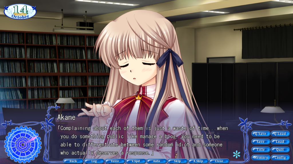
Not all of our UI is even close to finalized, but I’m mostly certain one thing is clear: The main game UI of Steel Hearts will be limited to the text box, the nametag, and the text itself (and choice boxes when applicable). The rest of the screen is to be reserved for the images of the game itself. Buttons and UI are visual clutter–it might not be bad in normal scenes, but in scenes where our protagonist is, say, in the cramped interior of a walker, complete with dials, knobs, optics, and a limited viewport, using a limited screen space effectively is paramount.
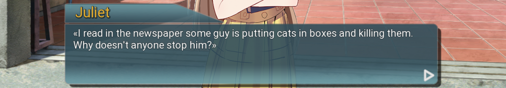
Above is a mockup I made of a possible textbox (non-UI elements are just placeholders). Simple, concise, and distinct is the aim.
Next time you play a VN, notice how they use (or don’t use) stylistic, textual, or visual elements. What do you find effective or non-effective uses of the medium? I’d love to hear some comments.
A Note from the Director
Hello folks, it’s me, Havock, the Directorman ™.
A large part of our choosing to keep prose out of Steel Hearts is the fact that it actively takes the reader out of the action. By including expositional prose describing actions, events, motivations, etcetera, it constantly reminds the reader that they are not the protagonist. In my experience, this hampers emotional engagement.
It’s my personal opinion that one of the most important factors of emotional engagement in a story comes from having a protagonist that the reader can see a little bit of themselves in. People need something they can connect with in a story, something they can insert themselves into to really feel it.
By having no prose, something interesting begins to happen. The reader begins to be tricked into believing that they see themselves in the protagonist, because the protagonist’s actions are being attributed to them. Be they abusive, boneheaded, or oblivious, the reader puts themselves into the pilot’s seat. “This is me now,” the reader says to themselves, “This is how I am.”
It might be manipulative, but it does work. You see it in Muv-Luv and Steins;Gate (both huge inspirations for our project). You also see it to an extent in media such as Welcome to the NHK.

Make no mistake, Steel Hearts is intended to be an emotional experience. This is not just something to watch Caleb experience at arm’s length–it’s something that we want you to be right there in the thick of it with him. We want you to be him. We want you to shoulder every one of his hardships, and to celebrate every one of his victories as your own.
Afterword
Thanks for reading! If you’re interested in Steel Hearts, feel free to follow this blog, or follow us on twitter at https://twitter.com/heartscorps.
Contact me at:
Twitter – https://twitter.com/PalladionHearts
Discord – Palladion#5914